
Articles > International Automotive News
Fiat
FIAT AND CHRYSLER ADOPT A NEW LOGO
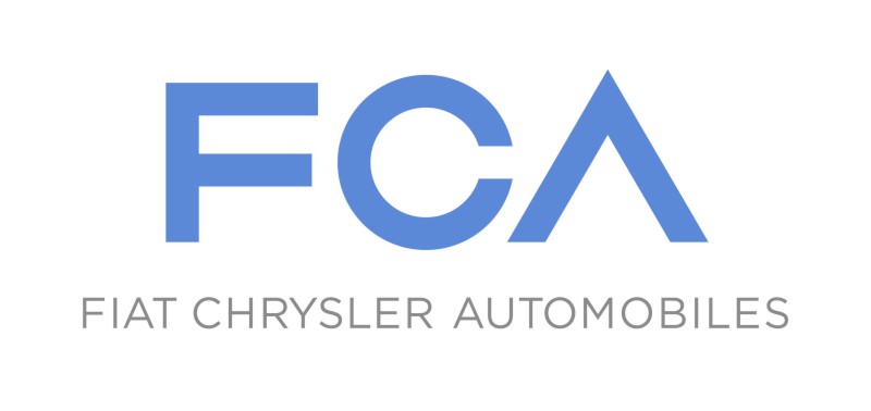

Created by RobilantAssociati, this branding project began with definition of a distinct strategic concept that served as the basis for creation of the name, logo, house style and entire corporate identity, whose universal and essential forms are strongly expressive and evocative.
Use of an acronym helps create a transition from the past, without severing the roots, while at the same time reflecting the global scope of the Group’s activities. Easy to understand, pronounce and remember, it is a name well suited to a modern, international marketplace.
The three letters in the logo are grouped in a geometric configuration inspired by the essential shapes used in automobile design: the F, derived from a square, symbolises concreteness and solidity; the C, derived from a circle, representing wheels and movement, symbolises harmony and continuity; and finally, the A, derived from a triangle, indicates energy and a perennial state of evolution.
The logo’s design lends itself to an extraordinary range of symbolic interpretations. It uses a versatile, modern language capable of expressing continuous change without losing its core identity.
The new logo will be adopted by Fiat and Chrysler as soon as practicable and before completion of the reorganisation of the new Group.
TS
29.01.2014
Detroit - Turin - Amsterdam
Readers Comments:
No comments yet
Related articles:
 MASERATI LEVANTE DEBUTS AT GENEVA SHOW 2016 - NO MIDDLE ...
 Chrysler-Dodge Group recalls 813.000 Jeep Grand ...
 FIAT CHRYSLER AUTOMOBILES FCA: FIAT S.p.A. REORGANISES ...
 NEW 2012 JEEP GRAND CHEROKEE SRT8 SUVS DELIVERED TO ...
 CHRYSLER IS RECALLING JEEP WRANGLER, JEEP CHEROKEE, ...
 LESS IS MORE: FIAT'S TWO-CYLINDER MARVEL DOMINATES ...
 FROM BETHLEHEM TO BEAULIEU: MIDDLE EAST CHALLENGE CARS ...
 FERRARI DRIVERS ALONSO AND MASSA RECEIVE AN ABARTH 695 ...
 Jeep launches new 2011 version of iconic Wrangler
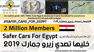
#SaferCarsForEgypt
The biggest automotive group and Road Safety initiative in Egypt and the Middle East
 Want to sell your used car or buy one? Then check out our new used car market section
here!
Want to sell your used car or buy one? Then check out our new used car market section
here!
Mohamed Sheta on social media:
 Looking for a good service center or aftersales customer service? Did you have any bad experience with your car dealer or service center? Then check our 'automotive evaluation charts'
here!
Looking for a good service center or aftersales customer service? Did you have any bad experience with your car dealer or service center? Then check our 'automotive evaluation charts'
here!
Latest Test-Drive Video and CEO Interview

Ford EcoSport Titanium Test-Drive ... Part 1
Nile TV
Mohamed Sheta
LIVE ON AIR
Every Wednesday in The Breakfast Show on
NILE TV INTERNATIONAL
8.30am – 09.00am LIVE

LIVE ON AIR
Every Wednesday in The Breakfast Show on
NILE TV INTERNATIONAL
8.30am – 09.00am LIVE
MOHAMED SHETA
LIVE ON AIR
Every Thursday
on Egypt's most influential radio network:
Radio DRN 93.7 FM
Live from 6-8pm

on Egypt's most influential radio network:
Radio DRN 93.7 FM
Live from 6-8pm
Autoarabia Group @ Facebook.com
Join Autoarabia Group @ facebook.com
...cars, racing, tuning and events in Egypt and Middle East
Is Egyptian car market corrupt or collapsing?
Is the Egyptian car market collapsing or is it just a corrupt and unprofessional car market?
This is surely one of the most asked questions these days. Everybody is asking ...
FORMULA 1

AutoArabia Consulting
International Engine of the Year Award
Middle East Car of the Year
IRF seminar
Road Safety & Public/Private Partnership
International Road Federation
International Road Federation

Interview
German Ministry of Foreign Affairs website interviews Auto Arabia's Editor Mohamed Sheta
Read more
Crash Test Results
International Herald Tribune motoring supplement
Subscribe
Car Data
Egyptian Car of the year award
Send an SMS to 93401 or call 5525 from any Egyptian mobile phone